Which white? Choosing a white that works in Perth light
13 July 2026 · 3 min read
Perth light is bright, warm and hard. The whites that look calm in a Melbourne showroom can look grey or acidic here.
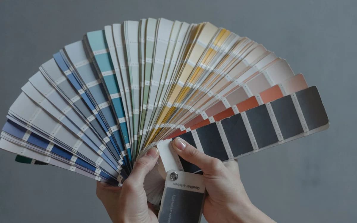
White is the most-specified and least-considered colour there is. There are hundreds of them, they are genuinely different, and Perth's light treats them differently from anywhere else in the country.
What makes Perth light different
**Intensity.** Very high UV and a great many cloudless days. Light arrives hard and bright.
**Warmth.** Perth light carries a warm cast, particularly in the long afternoons.
**Reflected light.** Limestone, light render, pale paving and sand all bounce warm light back into rooms. A north-facing room here receives considerably more reflected warmth than the same room in a temperate city.
The practical consequence: **whites with a warm base can read yellow or creamy here**, and cool whites that look crisp in a showroom can go grey and flat.
Understanding the undertone
Almost no white is neutral. Each has a hint of another colour, and that undertone is what you actually respond to.
| Undertone | Reads as | Works where |
|---|---|---|
| Warm / yellow | Soft, creamy | South-facing rooms, cool light, traditional interiors |
| Warm / red | Pinkish, cosy | Rarely a first choice in Perth's warm light |
| Cool / blue | Crisp, clean | North and west rooms with strong warm light |
| Cool / green | Fresh, slightly grey | Versatile, popular in contemporary interiors |
| Grey-based | Contemporary, muted | Well-lit rooms; can go flat in low light |
**The Perth rule of thumb:** rooms with strong natural light usually want a white with a slightly cool or grey undertone to balance the warmth. Rooms that are shaded — south-facing, or under a deep verandah — want a warmer white or they read cold and dead.
Levels of white (LRV)
Light Reflectance Value measures how much light a colour returns, from 0 to 100. Whites typically run from about 75 to 93.
- **88–93:** brilliant whites. Maximum brightness, can feel clinical in strong light
- **82–88:** the practical middle. Most popular interior whites live here
- **75–82:** off-whites and soft whites. Warmer and more forgiving on imperfect walls
In Perth's bright light, very high-LRV whites on a north-facing wall can be genuinely uncomfortable — glare rather than brightness. Dropping a few points makes a room noticeably calmer without looking dirty.
Trim versus walls
The traditional approach is a brighter, cleaner white on trim than on walls, which gives definition to the architecture.
The contemporary approach — same white on walls and trim, differing only in sheen — makes rooms feel larger and calmer, and it is considerably more forgiving where the trim is not perfectly straight.
The one combination to avoid
A cool white trim against a warm white wall, or the reverse. Undertones that clash read as dirt rather than as contrast, and it is the most common self-inflicted colour problem in a repaint.
Testing properly
Do not choose from a chip. Chips are small, they are surrounded by white card, and they lie.
- Get sample pots and paint **A3-sized patches**, two coats
- Paint them on **more than one wall** in the room — north and south walls will look different
- Leave a **white border** around each patch so it is not being compared to the old colour
- Look at them at **8am, midday, 4pm and under your artificial lights at night**
- Leave them up for at least **two full days**
Ceiling colour matters too: a bright white ceiling bounces light down and shifts how a wall colour reads.
Whites on exteriors
Outside, everything intensifies. A white that is pleasant indoors can be genuinely glaring on a rendered wall in full sun, and reflected glare onto neighbouring properties is a real consideration.
Off-whites and soft greys in the 70–80 LRV range are much easier to live with on a Perth exterior, and they show dust and chalking less than a brilliant white.